Reviews

Wednesday, 26 June 2013

Free Range Degree Show - Photography

As I've already posted a few degree show posts, the circuit can't be completed without visiting the big one - Free Range. Many university shows come together to take over the cavernous space afforded by the Old Truman Brewery.

The last two weekends focussed on photography. From the hundreds of works on display I've picked out my highlights:

Miles Roberts creation of ghostly after-images of people in front of landscapes reminded me of our transitory presence on earth, and that nature has been around much longer.


Lauren Burton takes overexposed images that appear to be the sun but are actually streetlights. The blurred exposure of her works reminded me of the excellent Rinko Kawauchi who is more interested in the beauty of light than the composition of the shot.


I quite liked Alicia Poyntz's mixture of fairytale and fashion shoots. There's always been a link in my mind between the two glossy worlds that have a darker undercurrent.


Mat Colishaw gave a new and poignant take on the Dutch still life vanitas paintings by photographing the last meals of death row inmates in a similar style. Sam Coe's  version is much more humorous where every day foods such as loaf of Kingsmill and Innocent juices are given the limelight.


Gemma Pepper was one of my highlights. Her capturing of the detail of peeling walls and the utterly mundane make you stare longer to catch every imperfection in her images of nothingness.


Marie Edwards has to be my top pick from the two weeks of photography. Her mix of still life and video create a mesmerising blend as most of the scenery remains still but slowly come to life as birds flutter by or chimney emits smoke. Rob and Nick Carter have a similar style of work at Manchester Art Gallery but these are better in my opinion.


Dan Parratt has chosen to photography petrol stations. They are just part of the landscape that we usually ignore but by making them the centre of attention, he finds something beautiful in them. Capturing and bringing a sense of grandeur to a 'non-place' has the hallmarks of William Eckersley. 


These are my photography picks, now looking forward to two weeks of fine art.

Saturday, 22 June 2013

Goldsmiths Degree Show

In keeping with my promise to get to more degree shows this year, I went to the Goldsmiths exhibition last weekend.

The whole feel of the art was very 'on trend' with plenty of video art and two very interactive exhibitions - one involving black lights and the other where you had to climb on top of a giant metal crate, and I had to sign a health and safety disclaimer before I was allowed to climb.

Despite the prevalence of video and abstract works, it was the more representative art that stood out for me. With two artists in particular that I think are ones to keep an eye on:


I liked Amanda Lee's Paris / Kenya work where a lone tree in a desert has the Paris Metro superimposed on top of it so it becomes an obstacle for incoming trains. The contrast between natural vs artificial light and isolation vs busy crowds makes this a great photograph.

Her other work uses a similar technique with a Philadelphia train platform and a Hong Kong airport. By placing arrival times above the heads of passengers on a moving walkway makes for a humorous dig at the regularity of life.


Johnny Hoglund's Yawn series simply involve moving strips of the canvas out of alignment to create a distorted face. Yet the impact of this technique mixed with the monochrome palette creates a Bacon-esque feel to his work that's visually striking.

Despite lots of work being on display, these were the two that really stood out for me.

Tuesday, 11 June 2013

Visions of the Universe

Verdict: Go see it
Where: National Maritime Museum
When: Until 15 September

When you watched the informative BBC series 'Wonders of the Universe' the overwhelming theme was our insignificance in the grand scheme of things and how we're all made up of the remnants of a long ago supernova. Visions of the Universe at the National Maritime Museum has taken a completely different, and more positive, tack and focusses on how we've captured the universe around us and our achievements as a spacefaring species.

The exhibition is dedicated to the memory of Sir Patrick Moore, and like him this show is about educating us and letting us marvel at the secrets held within the night sky.

The Andormeda Galaxy. Copyright Aggelos Kachagias

The opening exhibits do a great job of teeing up a catalogue of our achievements. An 1835 sketch of the distant Orion nebula contrasts with the close-up that the Hubble telescope has given us - bursting with the colours of star formation and intergalactic particles.

The moon receives the same treatment and it's astounding to see images of the far side of the moon taken by the Lunar Reconnaissance Orbiter - a view that only a few sets of human eyes have ever observed directly. A speeded up video of a Lunar month then hypnotised me with its constant change in size as the moon encircles the Earth on its elliptical orbit.

Next comes the fiery heart of our solar system the sun. Close-up images of it in UV light and of a sunspot make it seem like it could explode at any moment. Which it is constantly doing, as it's essentially a giant nuclear fusion reactor.

It's worth noting that many facts in the exhibition won't be new to astronomy fans but there's a few special ones that are worth re-iterating. For example, one of nature's most majestic sites, the solar eclipse, only occurs because due to a massive cosmic coincidence the sun happens to be 400 times further away from us than the moon, and also 400 times smaller in the sky.

Another view of the sun is in the blue-green of extreme UV light, it seems almost magical like a whirling ball of alien energy.

Next we have the planets of our solar system and the big screen is saved for a panorama of Mars taken by the rover Spirit. When sat encapsulated by this gargantuan curved screen, it's as if you've been transported to the desolate surface of the red planet.

The images of Saturn from the Cassini probe are also magnificent but let's not forget our humble planet in all of this. A night time view of earth shows the various cities 'lighting up' and it's impressive how certain cities and continental boundaries clearly stand out even in the darkness.

Earthrise as seen from Apollo 11 makes you wonder how deeply spiritual an experience it must have been - to lose sight of your home and then see it rise once more.

Earthrise. Copyright NASA Johnson Space Centre

It's when we get to the deep space section that the images become even more awe-inspiring. Sure, many are recycled from previous Astronomy Photographer of the Year exhibitions but they're worth another viewing.

A Ralph Waldo Emerson quote on the wall states that 'the sky is the ultimate art gallery just above us' and how right he is. The famous 'pillars of creation' photograph taken by Hubble shows the birth of stars within a gaseous nebula - is this the universe's equivalent to Botticelli's Birth of Venus? It's also a glimpse at the past as it's 9.5 light years away- just this fact alone is difficult to comprehend, that we have advanced so much that we can see stars being born ... in the past!

The explosion of colour in the photograph of the Butterfly Nebula is so spectacular it puts Renoir in the shade. It's an image so beautiful, it can make you weep.

And I could go on. Four galaxies on a collision path, astronauts floating in space and the aurora borealis seen from the International Space station are among many more spectacular photographs on show.

The Crab Nebula (M1). Copyright NASA, ESA, J. Hester and A. Loll (Arizona State University)

The only image missing is the famous pale blue dot photograph of Earth taken by the Voyager probe as it left our solar system. It's one of my most inspiring shots so a shame it wasn't included.

This minor quibble aside, this is a well curated exhibition that, if it doesn't blow your mind with its information, definitely will with its superb images. Go see it.

Wednesday, 5 June 2013

Pinta Art Fair - Highlights

Pinta Art Fair returned for its 4th year to Earl's court exhibition centre after a successful run last year. It's now bigger, with Spanish and Portuguese artists under its 'Latin American' umbrella. Though the galleries themselves are global with some British galleries such as Jagged Art and Rosenfeld Porcini having stands. Central and South American art has been doing well of late, so Pinta is looking to capitalise on this.

I'm not a massive fan of abstract and conceptual art, but I was pleasantly surprised by last year's fair where I liked more artists than I thought I would given that there was a lot of both conceptual and abstract art on display.

The atmosphere is different to most other art fairs, each stand spaces out its art - no cramming in as many works as possible. And it's a lot quieter than other fairs - granted I went during the press view, but that was less busier than comparable press views at Art13 or London Art Fair.

The one confusing aspect was the choice of a mid-week run. I've never come across an art fair that doesn't capitalise on the weekend opportunity to draw in visitors so we'll see if this is reflected in the official headcount once the fair comes to a close.

But on to the art on display. I've picked my top choices below:


Manuel Merida's minimalist circles of red, blue and white are both simple and hypnotic. As they gradually turn, the coloured sand inside falls downwards in clumps, under the spell of gravity. It's both cathartic and a commentary on life in that it may not always be smooth but it continues nonetheless. Rather than see this as nihilistic, I saw it more as an acceptance that life is inherently imperfect but beautiful all the same.

  
This photograph by Andre Cypriano titled 'Sugar Ball' sums up Brazil in an image. A beautiful beach with the famous Sugarloaf mountain in the background. But taking centre stage is football, a tatty ball that's as if children have been playing with it for years but still the symbol a nation is associated with.


I enjoyed this surreal painting of rippling waves of plastic forming chairs, making the chairs seem like they have a train akin to a wedding dress. It only works due to the mundane nature of the focal object.


Claudia Jaguaribe photographs sets of books on a shelf, when lined up the spines form an image of a rainforest. It's a direct message about the origins of books and how they contribute to deforestation but it's done in an innovative and varied way that catches the eye.

Moris is an artist who I can't find any images of his work that is on display at Pinta. He's created Calder-esque mobiles made up of rusty saws, machetes, screwdrivers and roll of dollar bills. They are the instruments of war but they form something so delicate - this contrast reminded me of Pedro Reyes' musical instruments made from guns and the 'Violentcello'.


Paula Rivas' hypnotic installations involve round objects, or molecules on wires weaving up and down as if they're dancing to a rhythm we can't hear. Reminded me of the Kinetic Rain sculpture at Singapore airport but on a smaller scale. It was my favourite work of the show.

One other standout piece (again no image available) is of to tourists near a natural wonder that bears a resemblance to the pillars of the Giant's Causeway. However one tourist is on top on her phone, the other below staring at whatever happens to be on her phone. Neither is soaking in any of the natural wonder around them - a damning indictment of our 'efficient' modern society.


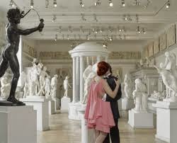
Marta Soul pokes fun at high society. As this couple kiss, they are seemingly unaware of the statue ready to lash them. In another image a couple on a grand staircase in a plush mansion, lie slumped as if they've been killed. It may not be s subtle as Juno Calypso's work but never takes itself too seriously and so doesn't feel over the top.

These are my top picks and well worth exploring if you can find the time.


Saturday, 1 June 2013

Degree Show highlights - Central St Martins and Westminster

I haven't attended degree shows since I started art writing so thought I would change that this year. The first two were Central St Martin's and Westminster University - the two couldn't be more different. Read on for my top picks:


This is a vast show as you'd expect from an arts institute of this pedigree. The number of artists on display meant it had the feel of an art fair - with all the pros and cons that come with it.

It guarantees that I'd like at least some works but the art overload meant that pieces that require reflection, are abstract or slow building (especially applicable to video art) often failed to grab my attention in the few seconds I had for an initial glance.

First to grab my eye was Helen Saunders' 'still life videos'. The abandoned yet serene scenery she's captured has a melancholic beauty to it. Yes it is a video and subtle, the irony of my views in the previous paragraph are not lost on me.


Shinji Toya's booth challenges the nature of art. By asking a computer to randomly generate an abstract image, it questions whether abstract art created by humans should have any more intrinsic value. A similar theme to that raised by the Outside Art exhibition at the Wellcome Collection.


Tanya Tier's sense of humour also appealed to me - a giant hammer on a chain is linked to a panel that says break in case of emergency. The futility of the work brings to mind all the nonsensical signs we encounter in everyday life.

Mette Hammer Juhl has produced a playful series where everyday objects are transformed into fountains. It's fun but is also an attempt to bring something magical into an often mundane world.


Light has been a growing influence in the art world, and art students have also been experimenting with it. There were some particularly strong works featuring light here. 

Louise Beer's pulsating strobe lights in a dark room are an intense experience, only matched by Olafur Eliasson's fountains in the Hayward Gallery's Light Show. You can only bear it for a few minutes but the light appears to jump out of you and it leaves you feeling disoriented.


My favourite work of the exhibition was by YuLong Wang. It's a combination of laser light and what I assumed to be dry ice to create a primordial soup of shifting shapes in the vapour. By encouraging visitors to blow on it, creates rippling light effects that are captivating.

You will have noticed traditional painters are lacking in my highlights and I was disappointed by the lack of any cutting edge painters - particularly in representational works. The one painter that stood out was Marianne Morild for her use of bitumen to give her work a depth and weight that would normally require lots of layering of paints. The splashes of colour gave this work a Fiona Rae-esque feel to it.


This exhibition couldn't be more different to the above and I preferred its layout. It utilised the cavernous space of the Ambika P3 to display works that were neatly spaced out, giving them room to breathe.

This meant we had less works on offer and only two works stood out for me.

Kostas Synodis plays with our views on the solidity of walls by having a clamp appear to compress a wall and pipe pass straight through another. Here's an earlier work of a similar ilk:


As well being humorous it also makes the viewer feel at unease. Plaster walls are always seen as safe and reliable, we lean with our full body weight upon them and think nothing of it. This artwork makes us rethink whether we should be so trusting.

Nabeelah Moosun has mocked up a chamber akin to those used to handle radioactive materials. Gloves on each side allow visitors to handle the objects inside and you expect there to be something dangerous inside, but there's nothing within the sheets or beneath the cardboard. This anti-climax spoke to me of the nanny state and the culture of fear that we're surrounded by.

Friday, 31 May 2013

Manchester Art Gallery

As I was in Manchester for a training course during the day, I decided to explore its art gallery. Great to see they also do late openings on Thursdays much like in London so this gave me until 9pm to wander at my leisure. Note: This is my first comparison between London and Manchester galleries and it won’t be my last – London is my home after all!

Another similarly is that like the National Gallery they also had classical musicians playing during the late opening, which is always a nice ambience for exploring art – but the purist in me prefers the silence to absorb the detail in the works.

I was gutted that I arrived the week after the Raqib Shaw exhibition had ended – I loved his work a few years back at the White Cube so I’m sure I would’ve enjoyed a larger exhibition.  But luckily there were many works that were worth the trip - the quality of the collection will never match those of the major museums in London but I went on a chronological tour and have picked out some highlights. 

The first thing to hit you is the fantastic atrium and grand central staircase where every wall at the top of the stairs is covered with paintings to admire as you ascend.  Ignore the familiar names like Tissot and Sickerts – it’s not their best works and they pale in comparison to the superior neighbouring works by lesser known artists.


The staircase is flanked by a diptych of reliefs by Harry Bates titled War and Peace respectively that literally jump off the walls in a display of expert casting. Also of note is Edward Matthew Ward’s Byron as he stares longingly through a window at the object of his affections – the contrast of internal warmth versus the darkness that envelops our protagonist gives him the sinister air of a disturbed stalker.
However, the best work is a portrait of a pretty young girl by Albert Lynch – despite her youth stares confidently back at the viewer.


We then pass through rooms with familiar names like Reynolds, Gainsborough and Hogarth but these didn’t stand out for me. When we get to a Turner depicting boats amongst tumultuous waves it’s amazing to see how one of his works can own a room and drown out adjacent paintings. This is when I recognised that having all the Turners together at the Tate Britain does rob them of their potency to a degree.


The oddest addition to these classical paintings is a lone Banksy – it’s interesting to see how the few contemporary works in this collection have to be hung incongruous to the rest of the art. He’s a major artist that deserves to be displayed in a gallery so it must be a challenge deciding where to hang it.  The other notable contemporary work is a video by the divisive Spartacus Chetwynd, but it lacks the barmy energy of her Turner Prize nominated performance.

The Pre-Raphaelite collection is excellent. Even though I’d seen the Tate show only last year, I was still impressed by the powerful works. John William Waterhouse idealises feminine beauty in his painting of Nymphs while John Millais’ biblical scene of Moses being supported by his sons would not look out of place among early Renaissance works.  Arthur Hughes’ Ophelia contemplating plunging into a lake to drown herself is evocative – it may not be as effective as Millais’ Ophelia but is still a great work in its own right.


The impressionism and post-impressionism section can’t rival the collections at the National Gallery or the Courtauld, but breeze through these and head to the Dutch paintings section to see a fascinating juxtaposition of classical and contemporary art.  Interspersed among the vanitas paintings are Mat Colishaw’s ‘Death Row’ series – easily his best work that takes the last meals of death row inmates and photographs them in a Chiaroscuro style to capture the emotion that these plain foodstuffs belie.


On an adjacent wall is a ‘moving still life’ by Rob and Nick Carter. It’s a video work that appears to be a still vase of flowers until the breeze flutters the petals – wait long enough and a snail, ladybird and butterfly all make appearances. It’s an interesting take on still life and in my opinion better than the similar works by Julian Opie.

There is also some Lowry works scattered about which only sought to whet my appetite for the Lowry exhibition coming soon at the Tate. 

I’ve purposefully re-arranged my recounting of the gallery to preserve the best ‘til last. Gallery 9 states that it’s a temporary exhibition but please let it be permanent as this small room is worth the trip up to Manchester just to see it. There is an impressive array of Francis Bacon works, with a screaming homage to Pope Innocent a real treat.

For me the gallery’s best work by miles is a huge Kossoff painting of York Railway Bridge from Caledonian Road. I’ve recently seen a great exhibition of his work in London but this blows all of them away. The paint is so thick and effusive that you feel that if you touched it, the paint would leap off the canvas and encase your hand – it’s like the work is alive and breathing! No image could do it justice so I haven't included one.

Overall an enjoyable visit with some excellent works, and I recommend you pop in if you’re ever in Manchester. 

Saturday, 27 April 2013

The Other Art Fair 2013 - Highlights

The Other Art Fair is a bi-annual art fair held at the cavernous Ambika P3 opposite Baker Street station. It's an opportunity for artists not represented by galleries to showcase their works and for the savvy collector to pick up a bargain - no gallery representation means no commission and reasonable prices.

This format naturally lends itself to the cliched mixed bag of art, some would argue that they aren't represented by galleries for a reason. And last year's fair was disappointing. But this year's jury, including the critically acclaimed artist Yinka Shonibare, has resulted in some great artists being featured.

Here's a run down of my favourites:

Before I even got to the fair, there were Toni Gallagher's rats made of ice lining the walk from the stairs to the entrance. Here they are earlier in the year on the Hungerford walkway that connects Embankment to the South Bank


If it weren't for the fact they were still being laid out as I arrived, I may not have noticed them. 

Once inside the fair, the first stand to really grab my attention was the metal landscapes and cityscapes by Frederic Daty:


I was told that the artist starts with a single sheet of metal and then laser cuts way pieces and uses various substances to rust the sculpture and create the impressive range of colours. I found the more rusted works to be my favourites as they felt more rooted in realism - this forest was one of two that I really liked.

Hidden underneath the stairs were the clever lenticular prints by Shaun Caton and Derrick Santini. Their works change as you walk past them and play out scenes such as two identical women fighting each other or a woman speaking to you.


Clearly a still photograph doesn't do it justice but it was great to see a collection of their work after seeing one work of a swan fighting a woman at Cynthia Corbett's Young Masters exhibition.

Next up was Laurence Poole who take utilitarian objects to make art, such as a colourful canvas of matchbox cars or a soundwave made from vinyl records.


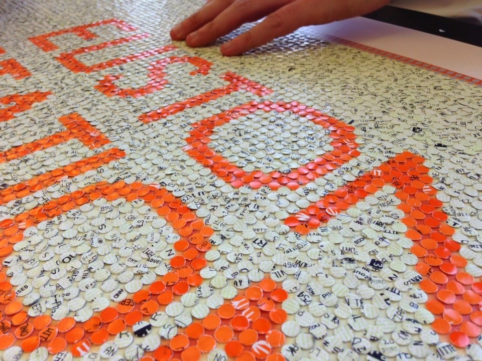
The Acrylicize Collective had a large scale replica of a monopoly board square marked as Euston Station. But it's only upon a closer look that I realised it's made up of hole punched National Rail tickets - very impressive, here's a close up.


Now my next artist has already featured on Londonist for her iPad drawings. I got to see some of Nadja Ryzhakova's newer work and was impressed by her rendition of the Lloyds building in a thunderstorm. It's not on her website but you can enjoy her underground full of fish-people instead. All of her works are all the more impressive for having been done on an iPad.


I enjoyed the photo collage's of Barbara Nati as she merges the present with a science fiction future. There's a cheeky sense of humour at work with an astronaut within a tram on an alien planet.


Last but not least was probably my pick of the fair. Conrad Engelhardt takes corks that have been naturally stained and uses them to create nudes and a portrait of Marilyn Monroe. 


It's a slow process but use of innovative media is doing very well, just look at Nick Gentry and his use of floppy disks or David Mach's wire hangar sculptures. For this reason, I was surprised that a gallery like Opera or Rook & Raven hasn't already snapped him up.

In summary, some great artists on display and well worth the visit.