Reviews

Monday 30 January 2012

The Mystery of Appearance

Verdict: Go see it
Where: Haunch of Venison, Mayfair
When: 7 December 201118 February 2012

This exhibition at the newly refurbished Haunch of Venison gallery focuses on ten of Britain’s most important post-war painters, who would go on to influence the current crop of British artists.

Usually when a smaller gallery displays works of renowned artists, you always assume that they will have their lesser works on display and the real stars will be the less recognised artists.  In this instance both shine through.

In terms of star power, there is a brilliantly humorous painting by David Hockney entitled ‘Man in a Museum’ where a painting is watching the visitor, and Francis Bacon’s ghostly re-imagining of Velazquez’s portrait of Pope Innocent (pictured below).


However, the real star of the show has to be Leon Kosoff’s works with his multilayered style of painting bringing palpable texture to his work and blurring the line between painting and sculpture (an example pictured below but this flat view doesn't do it justice).


It’s impressive that they’ve amassed such a collection and, as some of the works have never before been on public display, it’s an opportunity not to be missed.

David Hockney: Moving Focus

Verdict: Go see it
Where: Alan Cristea gallery, Mayfair
When: 19 January – 18 February 2012

First, I should set out that this exhibition is in no way on the same scale of Hockney’s other exhibit at the Royal Academy.  That’s a blockbuster exhibition and its scale cannot be matched by a much smaller gallery, but there are some real gems on display.

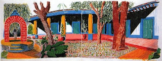
There may only be a limited number of works on display but there is a focus on the time he spent at the Hotel Acatlan in the 80s and the paintings of its courtyards.  These paintings use the bolder palette that is somewhat lacking at the Royal Academy exhibition and there’s a rawer feel to the exhibit with forms that aren’t clearly delineated and blank areas where he didn’t have time to paint.  This gives these paintings a vibrancy that brings them to life and is more akin to what Hockney has become famous for.


If like me you left the Royal Academy exhibit a little disappointed that he hadn’t captured the intensity of his past works (see my other review), then this is the perfect accompaniment to that exhibit – plus it’s only walking distance away so you can visit afterwards to compare and contrast.

Lygia Pape: Magnetized Space

Verdict: Worth a look
Where: Serpentine gallery, Hyde Park
When: 7 December 201119 February 2012


The Serpentine gallery is located in the middle of Hyde Park next to the Serpentine (hence the name), the perfect idyll setting for an art gallery, though not the easiest to get to.

It’s well known for hosting less recognised artists and its current exhibition is no exception.  The late Lygia Pape was a Brazilian artist and this retrospective displays works spanning her career from the 1950s through to the 2000s.  She experimented with mixed media and ‘mixed’ sums up my view of the exhibition.

The first gallery is dedicated to her videos that aim to highlight the link between consumerism and our primal instincts.  The most prominent video with the double entendre title of ‘eat me’ shows close-ups of mouths eating foods and she has tried to hint at the mouth’s eroticism by overlaying a soundtrack that could have been lifted from a 1970s porn movie.  But you can’t help wondering if this would work without the music, and how this all seems to be an artificial construct that pushes, rather than guides, the viewer to an interpretation – we get enough of that in movies, we don’t need it in the art world!

Just as you think this may have been a wasted trip, you step into a darkened room where threads have been laid between the floor and the ceiling that glimmer in the overhead spotlights.  They possess an ethereal feel and shimmer as you walk around them, yet you feel as if the delicate web could easily entangle you if you stepped into it.  This is so different from the other artworks that you wonder whether this could be the same artist.

Once again you’re brought back to earth with her drawings that are so derivative of Mondrian and Matisse that there seems to be no progression on display, in fact one piece looks like a direct copy of Mondrian’s work.

But there’s one Matisse-inspired work that is joyous to behold – ‘book of time’.  This is a wall of small brightly coloured installations that look like pixelated video game characters from the Atari days.  You could enjoy exploring them for a good thirty minutes


All in all, a veritable mixed bag but there are two standout pieces (both pictured here) that are worth the trip alone.

Sunday 29 January 2012

Landscape Photographer of the Year

Verdict: Go see it
Where: National Theatre, Waterloo
When: 1 December 201119 February 2012


Every year, any photographer can enter the ‘take a view’ competition for landscape photographer of the year – as long as the photograph was taken in Great Britain,

The competition is now in its fourth year and they receive thousands of entries.  Of those received, the winners along with up to around 100 other photographs are on display in the Mezzanine section of the National Theatre.

It’s perfect for anyone interested on photography or not, and the ideal stroll during the interval if you’re watching a play at the theatre.

There are a range of landscapes on display from the classically beautiful, to the artistic, through to urban cityscapes.


Nobody can visit this exhibit and leave disappointed, there’s a photograph for everyone here and it will inspire you to get out there and explore more of Great Britain.

It’s surprising that a photo of electricity pylons or Torness nuclear power plant can be made to seem scenic.  The most arresting photograph for me was a shot of London’s square mile at night (pictured above).

The only disappointment you may experience will be in finding out that you can’t purchase prints of the photographs for your home.

Astronomy Photographer of the Year

Verdict: Go see it
Where: Royal Observatory, Greenwich
When: 9 September 201112 February 2012

This year’s competition had around 800 entries that were whittled down to 24 prize-winners, in various categories.

If you think this is purely the domain of the astronomy geek, you’d be wrong.  Sure there are photos that have been awarded prizes for technical merit but nearly half of the photographs on display were taken with standard cameras without the use of telescopes.

The overall winner was chosen for technical merit in capturing Jupiter and two of its moons but some of the more aesthetically pleasing pictures could have been taken by any amateur photographer – such as the Milky Way that can be seen over the tops of palm trees in Tahiti.

You’re guaranteed to walk away from this exhibit with at least a couple of the photographs leaving you in awe of the technical capability of the photographer or the beautiful scenery.  In some cases both, such as the remnants of a supernova explosion that looks like something straight out of Star Trek – though probably beyond Star Trek’s budget to create.


The ultimate photograph for me was the capturing of the International Space Station, docked with the space shuttle Endeavour, as it transited across the sun.

And if none of these appeals to you, and how could it not, then the views of Canary Wharf and the City of London, from outside the Observatory, will more than make up for it.  

Hajj: Journey to the Heart of Islam

This review has been published by the Londonist
Verdict: Go see it                                                                                     Where: British Museum                                                                              When: 26 January - 15 April 2012
The Hajj — the pilgrimage to Mecca — is central to Islam, yet as only Muslims are allowed to perform the Hajj, it remains a mystery to most people. The British Museum seeks to remedy this by offering a unique insight into the origins, history and rituals of the Hajj. A wealth of information is on display alongside artefacts ranging from the lavish banners carried by pilgrims, to the more mundane items such as the cups that they drank from.
In the Reading Room, the British Museum has arguably one of the premier exhibition spaces in the country and it has been used to great effect here. You begin to hear the adhan (the call to prayer) before you’ve even entered the exhibition and this immerses you in the reverence that is afforded to the Hajj.
There are many magnificent artefacts on display, from a delicate and ornately decorated quran to an opulent mahmul (a ceremonial palanquin). However, the focus of this exhibit is on the journey to Mecca itself and the weight of detail available makes this exhibit truly fascinating — from the life threatening challenges faced by the pilgrims through to the many famous historical figures who completed the Hajj.

The stories of modern British pilgrims and what the Hajj means to them helps present this ancient pilgrimage in a modern light, making it easier for the uninitiated to understand why it inspires such revelatory experiences amongst modern Muslims.
Some minor quibbles are that the exhibition is not as logically structured as it could have been and goes off on tangents a few too many times. Though these tangents usually result in some remarkable stories, it does give the exhibition a slightly disjointed feel.
You don’t need to be interested in the Hajj or Islam to find this exhibit both eye-opening and fascinating, though you should set aside at least ninety minutes to assimilate all the information on display.
In a time when most people are curious about Islam, this exhibition does an excellent job of shedding some light on one of its least understood rituals.

Thursday 26 January 2012

Hanne Darboven

This review has been published by the Londonist

Verdict: Give it a miss
Where: Camden Arts Centre, Hampstead
When: 20 January - 18 March 2012

This is also the first UK solo exhibition for Hanne Darboven, a German conceptual minimalist artist. The walls of both galleries are covered with her writings, musical compositions and drawings. The content of these notes ranges from geometric shapes to indecipherable scribbling.

One of the larger installations is an entire wall of her notes and their lack of coherence makes it feel as if the gallery is displaying what was found on the wall of a serial killer’s home – or at least Hollywood’s interpretation of a serial killer’s wall.


As the notes are often illegible or unintelligible they feel as if they are her private scribblings and not for public viewing. This, coupled with her writing desk in the middle of the gallery, provides a sense of both intimacy and intrusiveness, as if you’ve been allowed, or trespassed, into the artist’s mind. This is heightened by the knowledge that Darboven died in 2009.

At the same time, the private nature of the notes is also what makes this exhibition difficult to penetrate for the viewer. Though we’ve been brought into the inner sanctum of the artist, it feels as if a cipher is needed to decode her work fully and understand her innermost thoughts.

This lack of complete understanding might leave a bitter aftertaste for many viewers as they may feel as if they’ve been led halfway only to find an insurmountable wall preventing them from making the most of Darboven’s work.

Raphael Hefti: Launching Rockets Never Gets Old

This review has been published by the Londonist

Verdict: Go see it
Where: Camden Arts Centre, Hampstead
When: 20 January - 18 March 2012

Swiss artist Raphael Hefti specialises in interfering with the formation of materials and presenting the outputs. In his first solo UK exhibition, he focuses on the formation of glass.

Large panes of reflective glass have been altered to only reflect certain blue and yellow wavelengths of light, but the alteration was made while the glass was forming so it doesn’t have the artificial feel that you would associate with a colour filter.

As you walk around the room surrounded by these ‘mirrors’ what you see is a mildly surreal reflection of yourself and everybody else in the room. This exhibit highlights the link between colour and emotions, as a yellow reflection of you seems brighter and more hopeful while the blue reflection creates a more sombre tone – this may not be the reason why the expression ‘feeling blue’ came about, but after seeing your reflection in Hefti’s work you’ll think it should be.

However, the highlight of the exhibition is on display outside the gallery — two photographs of the patterns created when Lycopodium spores are burnt over photosensitive paper (Lycopodium being a type of club moss). Burning spores should create random patterns but the seamless interaction of the intense colours provides the illusion that Hefti has precisely directed the spores to create the effect he was after.


Though the photographs were created by tiny spores, they seem like representations of an event on a much grander scale with one photograph resembling a tumultuous ocean filled with different coloured dyes and the other an exploding star.

Sunday 22 January 2012

London Art Fair

Verdict: Go see it
Where: Business Design Centre, Islington
When: 18-22 January 2012

The London Art Fair is an annual coming together of over 100 galleries that take over the Business Design Centre for an extended weekend.  These galleries cover both classical and contemporary art, and have something for everyone. 

There is plenty of variety to prevent you getting bored; it’s just a question of whether your feet can keep up as there is a lot of ground to cover.

This can’t be like a normal review as this is not an exhibition but a chance to check out what galleries have available.  I imagine most visitors are merely curious than serious art collectors as most pieces will set you back at least £10,000 and some ten times that amount.

Though there are works of notable artists like Damien Hirst, Bridget Riley, Chris Ofili and L.S. Lowry; it’s the lesser known artists that really shine here, so I’ve compiled a list of all those that stuck out for me.

This year there were many artists experimenting with photo collage, some notable examples include:

  • Jane Ward takes photographs of her travel and layers them over each other on a computer before stripping away layers piece by piece to produce apocalyptic visions.  Last year her collages were more realistic but this years she’s produced some that are rather more tongue-in-cheek with inverted and swirling landscapes that look like they would be at home in the film Inception.

  • Tom Leighton specialises in creating seamless cityscapes with disparate landmarks.  At first it will feel like you are looking at a picture of St. Mark’s square in Venice before you quickly realise that the Cathedrale Notre Dame should not be at the end of it, nor should St. Paul’s, the Burj Khalifah and Flatiron building be part of the same skyline.  If they were that would be one magnificent skyline.

  • Yves Krief uses a very similar take to Leighton but focuses on America and a post-apocalyptic landscape littered with wild animals.  However, the colour palette used is much bolder than you would get with John Martin so there is a more light-hearted feel to it.

And the rest, in no specific order:

·         Tessa Farmer was back again with her miniature skeletal fairies (with the wings of houseflies) continuing their war against nature.  Farmer takes dead insects and the occasional mouse and creates miniature fairies and positions the two against each other in a macabre battle.

·         Annie Morris has created a wall of clothes pegs each with a self-portrait of herself drawn on it – one for every day.

·         John Stark’s paintings are similar to Krief’s works in that they also display apocalyptic visions with warm colours, however Stark’s work is much more darker as you’d be unlikely to see a blackened skeleton atop a pyre in Krief’s works.

·         Jenny Pockley has created paintings of the London Skyline at night that look photorealistic from a distance but are clearly paintings up close.

·         In contrast to Pockley, Alicia Dubnyckyj’s cityscapes are barely recognisable from up close but if you step back it becomes clear that it’s a view of London (pictured above) or Manhattan.

·         Jim Whitty has created a country river scene with such bright yellow it feels as if you’re looking at the direct reflection of the sun and not a painting of it.

·         Gigi Cifali photographs abandoned swimming pools so that they could easily be a setting for a horror movie.

·         John Monks paints desolate scenes – an abandoned house and a shipwreck – but infuses them with such colour that he almost resurrects them.

·         Peter Graham is another exponent of a bright palette but so much so that his café scenes are almost unrecognisable due to the glare given off by the painting.

·         Joseph Klibansky’s ‘New tension’ overlays a black and white New York with the bright colours from a South East Asian river scene, highlighting the superiority of nature over industrialisation.

·         Lisa Swerling is back again with her miniature sculptures of satirical scenes inside glass cabinets.

·         Marco Crivello creates spheres of swirling colour that looks like alien worlds or the earth when it was first forming into a ball of molten rock.

Nobody can walk away from the London Art Fair without seeing at least a few paintings that grab them and that they would like to purchase, if they could afford it.

Saturday 21 January 2012

David Hockney RA: A Bigger Picture

This review has also been published by the Londonist website.

Verdict: Go see it
Where: Royal Academy of Arts, Mayfair
When: 21 January - 9 April 2012

David Hockney is regarded by many as Britain’s greatest living artist. Understandably so, given his contribution to modern British art both through his works and in making modern art accessible to the public.
Landscape painting is an institution of British art, conjuring up images of the naturalistic paintings of Constable and Gainsborough and the more impressionistic landscapes of Turner.
So what happens when you put Hockney together with landscape painting? The Royal Academy is hoping that it will prove to be a winning combination, and the number of advance bookings suggests that they’ve got it right.
The first thing that hits you when you enter the exhibit is that Hockney has brought his own unique style to landscape painting and the bold colours instantly grab hold of you and pull you into his interpretation of the Yorkshire countryside. This immersion is made possible by the scale of some of his pieces and the fact that the largest gallery is covered in paintings from floor to ceiling – a room that you could spend hours in.

Throughout the exhibit you can see that the artist has experimented with various techniques, switching medium to video or using a starker palette but these dalliances are less impressive than their bolder, painted cousins.
One of the smaller galleries is dedicated to an experiment where Hockney has taken Claude Lorraine’s ‘Sermon on the Mount’ and slowly broken it down over a series of paintings from the realistic to the abstract. These paintings highlight Hockney’s mastery in the interpretation of life as art.
It’s only when he starts to experiment with the surreal that you feel like the exhibit is truly stepping up a gear. The fantastical colours of ‘May blossom on Roman road’ mixed with a swirling sky reminiscent of Van Gogh’s ‘Starry night over the Rhone’ suggest that you have stumbled into a Yorkshire in a parallel universe of Hockney’s creation. But just as it feels as if the exhibit is starting to get interesting we’re pulled back to reality with another landscape that looks just like five others you’ve seen in the previous gallery. When there are over 150 works on display, more of the same isn’t necessarily a good thing.
Hockney is capable of so much more. For example, one gallery displays some of his earlier landscapes and there is a painting of the Grand Canyon that uses such vivid colours that you can almost feel the heat radiating from the canvas.
The two questions that you have to ask yourself are: is this a spectacular exhibition that you should go and see? And is it everything you would like it to be? The answers are yes and no.
Though you will walk away from this exhibition feeling like you’ve witnessed some brilliant artworks by a modern master, you may not be able to shake the nagging feeling that if Hockney hadn’t played it safe and ventured further into the abstract and the surreal then this exhibition could have been so much more.

Tuesday 10 January 2012

The Artist

Verdict: Go see it
Where: At your local cinema
When: On general release

What is it? A modern black and white silent film that charts the fall of a silent movie star as the rise of 'talkies' makes his art form a relic of the past.


What I thought? Yes, I know a film may not fit in with the rest of the blog but this truly is a work of art and something very out of the ordinary for the film world that is usually pre-occupied with sequels and explosions – my kind of movies.

The film starts with a shot of one of George Valentin's (played brilliantly by Jean Dujardin) films and Valentin taking the plaudits once the film concludes. Valentin clearly laps up the attention but is a very likeable character so you feel for him when his career and marriage plummet as 'talkies' become all the rage and silent movies fall by the wayside.

This story revolves around the love between the two leads, with Peppy Miller played by Berenic Bejo starring alongside Dujardin. Both leads dominate the screen with their charisma and chemistry.

This takes nothing away from their co-stars Jon Goodman and the dog both having scene-stealing roles.

Though there are comedic moments, with knowing winks to the silent movie era, the plot itself has a dramatic edge and right until the end you're kept on tenterhooks on whether it will be a happy or a sad ending for the couple.

This is a rare experience to see something truly unique at the cinema, especially one that is on general release.

Going into this movie I thought that there is no way that I will like a silent, black and white film, but I'm glad to have been proved wrong.

Guildhall Art Gallery and London's Roman Amphitheatre

Verdict: Worth a look
Where: City of London

What is it? A collection of mainly Victorian artwork with London as the central theme. The gallery is also built on the remains of London's Roman Amphitheatre, which was discovered when they were building the gallery.

What I thought? When I visited the gallery the majority of the gallery space was dedicated to the temporary exhibition. Of the artists represented, there are no massive names but there are some notable British artists like Constable and Landseer on display. The central London theme gives the collection a coherent feel and includes paintings of historic moments in London's history such as the opening of Tower Bridge and Queen Victoria's parade through London. It's not the largest collection but definitely worth a look, especially for a Londoner.


The Roman Amphitheatre is impressive for how much of it remains considering how many times London has been rebuilt and it may be our only Roman remnant. Then it gets a little strange. The room's walls and pillars are decorated with Tron-like fluorescent green skeletal athletes and the contemporary-classic contrast is jarring, but I liked it though it won't be to everybody's taste.

Being located in the City separates it from other galleries geographically and also from the usual crowds that galleries get, especially on weekends. I went on Saturday and the deathly quiet of the city is always a strange experience. One to check out if you're in the area of have a hankering for some Victorian paintings.

Sunday 8 January 2012

Atkinson Grimshaw: Painter of Moonlight

Verdict: Go see it
Where: Guildhall Art Gallery, City of London
When: 19 September 2011 – 15 January 2012

What is it? An exhibition of the paintings of the Victorian Pre-Raphaelite-style painter John Atkinson Grimshaw. There are over 60 paintings on display stretching Grimshaw's career including both his time spent in Yorkshire and in London.

What did I think? British painting spanning both the Romantic and Pre-Raphaelite periods is known for its amazing attention to detail. Grimshaw definitely meets this high standard with exquisite detail in his paintings but what distinguishes him from the other painters of the time are his nocturne paintings.

The low level of street lighting that existed in Grimshaw's time gives the River Thames a serene feel to it but when the same effect is used to depict an urban scene with dock workers around a flaming barrel, the painting takes on a more foreboding look. Grimshaw is a master of capturing the effect of the moon on the translucent clouds it filters through and how the moonlight reflects off the wet cobblestone roads.

The painting of Piccadily is reminiscent of Pisarro's Boulevard Montmartre and makes you want to see what London would look like if we removed the electric streetlights and replaced them with gas lamps. The risk of a crime spurt would prevent this idea from ever getting off the ground, so Grimshaw offers us an insight into a time gone by and the level of detail in the paintings ensure that we get as close to experiencing it as possible.


Later in his career, Grimshaw switched to a more minimalist impressionistic style but this feels like a waste of his talent as he couldn't bring his naturalistic style to bear and therefore the paintings are nowhere near as intriguing as his nocturnes.

Alongside this is an by the exhibit by contemporary artist Liza Dracup of a set of photographs inspired by Grimshaw's works. She has chosen to focus on Grimshaw's early days when he painted the Yorkshire woods. The standout series of photographs is of the same view of a particular section of the woods on two separate nights and covered in snow during winter, that has a Narnian feel to it.

The exhibition costs £5 to enter and considering that there are over 60 excellent paintings on display, this works out as very good value for money. The rest of the Guildhall gallery is also worth exploring (but I'll write a separate review on that shortly).

Daniel Buren – ‘One thing to another, situated works’

Verdict:  Give it a miss
Where: Lisson Gallery, Marylebone
When: 23 November 2011 – 14 January 2012

What is it? Artworks that focus on bold lines and colours, using translucent or transparent media that interact with the natural light filtering through them.

What I thought?  Contemporary artists have been using simple bold colours, inspired by the likes of Mondrian and Matisse for many years now.  Does Buren bring any fresh insight to this field?  Frankly, no.

This small exhibition may be split into two different kinds of works.  The first set is blinds with coloured stripes running down them and they look uninspired.

The second, larger, installations show more promise.  They consist of raised panels of coloured glass that allow the natural light to filter through them on to the floor.  This has the potential to create an impressive effect but the two installations are outdoors and in a large room with a skylight respectively.   This is winter and the very little light coming through washes out the effect that the installations are seeking to achieve.  One can’t but imagine how much better these works could have been if this exhibition had been during the height of summer or had used artificial lights instead.


Nothing new to see here.